
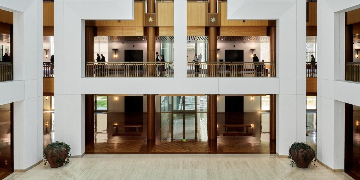

Walk into a well-designed room, and the first thing you notice is rarely the furniture or the finish on the walls. It is the light. A space can be beautifully detailed and still feel wrong if the daylight lands in the wrong place, and a plain space can feel generous when the light moves through it well.
Eric Wippman, an architect based in Florida, has built his practice around that observation. His designs are known for natural light, open plans, and outdoor elements, and in his hands those three are one idea rather than three separate features.
Light Is a Building Material
Most people treat daylight as something a window happens to let in. Architects who work with it seriously treat it as a material, with a direction, a temperature, and a schedule.
Where the sun enters at eight in the morning is a different design problem from where it enters at four in the afternoon, and a room used at both hours has to answer both questions.
Florida sharpens that calculation. Strong sun and long summers mean glass placed without thought turns a room into an oven, so the work is less about adding windows and more about aiming them. Overhangs, shaded openings, and orientation do as much for a space as the glazing does. Eric Wippman tends to start a plan by asking where the light needs to fall during the hours the room will actually be used, then builds outward from that answer.
What Eric Wippman Looks for in an Open Plan
Open space gets discussed as though it simply means removing walls. In practice it means deciding which walls are doing real work and which are only habit. A large undifferentiated room is not open. It is just large, and people tend to avoid standing in the middle of it.
The useful version of openness gives a space a few distinct zones without hard partitions between them. A change in ceiling height, a shift in flooring, a run of built-in seating, and daylight itself can all mark where one function ends, and another begins. His early projects, which included tiny homes and small office spaces, forced that discipline.
When there is very little floor area to work with, every square foot has to serve more than one purpose, and a plan either solves that, or it does not.
Bringing the Outdoors In
Combining modern architectural elements with nature has been a defining feature of his work since the beginning of his career.
That means more than a planter by the entrance. It means designing the edge between inside and outside so the two read as one continuous space: sightlines that carry past the glass, thresholds that sit flush, courtyards and terraces treated as rooms rather than as leftover ground.
The climate rewards this approach for most of the year. A covered outdoor room extends the usable footprint of a house or a community building without extending the conditioned square footage, which is a design win and a practical one at the same time. Designing with natural light and designing for outdoor connection usually turn out to be the same project, because the openings that frame a view are almost always the openings carrying the daylight.
Where Practicality Meets Ambition
Early in his career, Wippman worked alongside seasoned architects who taught him to balance creativity with practicality, and to make sure a design was not only visually striking but safe, efficient, and sustainable. That lesson shows up directly in how he handles light and openness.
Daylight is the cheapest lighting available and the hardest to control. Open plans are flexible and difficult to condition efficiently. Both are worth doing, and both carry a cost that has to be designed against rather than ignored.
Much of the daily work of a Florida architect focused on daylight and open space is resolving those trade-offs quietly, before they ever reach the client as a compromise.
What European Cities Teach About Space
His trips to Europe, where he has explored cities including Florence, Paris, and Prague, feed back into his design thinking.
Older cities are useful teachers on this subject because their buildings predate mechanical systems. They had to solve for light and air with geometry alone: courtyards, tall windows, deep reveals, and narrow plans that let daylight reach both sides of a room.
Those solutions do not transfer literally to a Florida site. The principles behind them do. Studying how a Renaissance courtyard moves light through a building is a way of examining the problem at its foundation, and that habit tends to produce better answers than borrowing whatever detail happens to be fashionable.
The Real Test Is How the Room Feels
A design succeeds when people use a space the way it was intended without being told. They sit where the light is good. They drift toward the view. They gather in the part of the room that feels held rather than exposed. None of that appears on a floor plan, and all of it is decided on one. Eric Wippman’s portfolio of design work has moved from tiny homes and small offices to hotels, community centers, and public buildings, and the starting question has not changed with the scale.
Where does the light want to be, and what should the room do with it. For Eric Wippman, that is not a stylistic preference or a signature to be repeated. It is the most reliable method he has found for making a building that people want to spend time in, and it is the question he expects to keep asking on every project ahead of him.